


|


As I mentioned in the previous lesson, gradations are what colored pencils are all about. Almost everything in a coloring book should have a graduated color blend. Simple colors really do not exist in nature, and complex colors are the mark of good drawing technique.
|
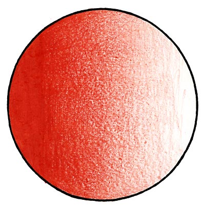
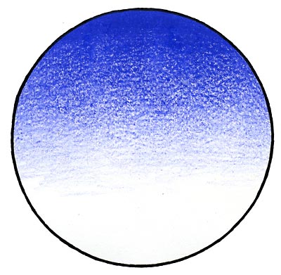
The simplest gradation is a 2-color blend. This is a transition from one color to another. Above is the start of a gradation. You'll see that it is completely solid at the left and very quickly gets lighter and lighter, leaving paper white at the other end. Some people like to leave paper exposed like this, and do their gradations using the white of the paper. I don't do it like that. For one, it leaves a rough texture, and two, the paper gets dirty quickly, so you'll not have pure white.
|
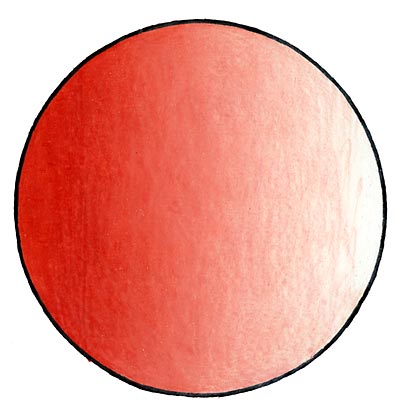
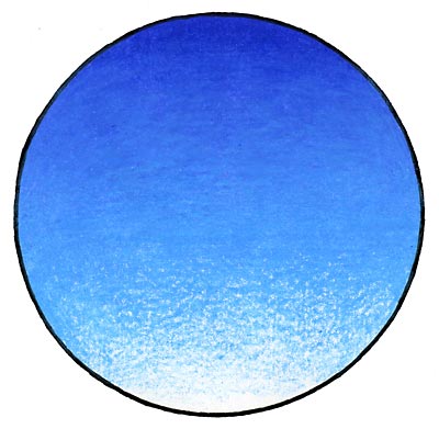
Now the circle is blended with White. You'll notice that is it much smoother, and an overall better blend of the two colors. As with most art, control is key to good technique, and blending to white gives you total control over the surface. Be sure to work the surface well, so there are no "holes" where the paper shows through. A solid, completely sealed surface is best with colored pencils.
|
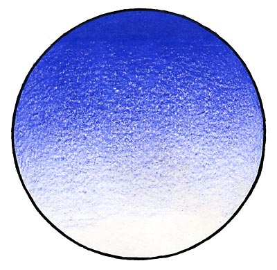 
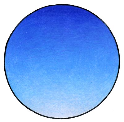
Above we see a 2-color blend from Ultramarine to Cloud Blue. This might be something you would do for a sky background. I started with the Ultramarine, colored a solid area at the top, and brought the gradation down to about 2/3rds of the way down, knowing that a light color will lighten the darker blue a bit. I then applied the lighter blue starting at the bottom and worked it up, making sure to blend all the way up to the solid area.
|
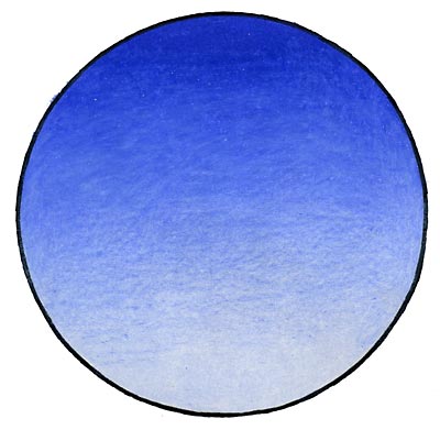
This is an example of a 3-color gradation. I used Ultramarine at the top, Non-Photo Blue in the middle, and Cloud Blue at the bottom. The third color always adds complexity and elegance to the drawing. Complex colors are the way to make beautiful drawings, and the more colors the better!
Even after the surface is sealed up, you can still add more colors on top. I often keep working the surface with complementary and unexpected colors just to give the drawing an organic and realistic feel. If you make a mistake, just "erase" the new color with whatever the color is beneath it. It is a patient and meditative process, don't rush!
|
Copyright © 2016 Stephen Barnwell
|